This is one of the grossest animations yet by me...but it's pretty funny He Hee!
Saturday, December 31, 2011
Friday, December 30, 2011
Pocket Watch Tattoo Design for Sis
I've never designed a tattoo before, but my sister, Brooke, wanted me to design her a pocket watch tattoo...and she gave me no direction other than that, so this is what I came up with.
She wants some writing on it, but I'm not a calligrapher....
She wants some writing on it, but I'm not a calligrapher....
Wednesday, December 28, 2011
David Bowie
This took about 12 episodes of Modern Family to get done, it was pretty fun to do.
Largely inspired by: http://www.anniewuart.com/
and loosely based off this bowie picture, mainly the pose, I aged him to more of his "Heathen" album years.
https://blogger.googleusercontent.com/img/b/R29vZ2xl/AVvXsEh6b3EXSsF6-7OFkw1bYGxA3uoV-RfqyMJA5atXQ4DjSZnzLwbddt8-egaUtDe7uEURkSwgJMKpAEc5Z8UVRmTurWFMvob2oYKWSgXn6Eb7j5kYiaUI1q_VEgCKXiy7X_jUWLu0a0Y7fHQw/s1600/thinwhiteduke.jpg
Saturday, December 24, 2011
Awkward Family Christmas Caricatures
My family and me, and the reference for it
And this is my Grandpa and Uncle, I just used FB for their ref so I don't have the files for them
Monday, December 19, 2011
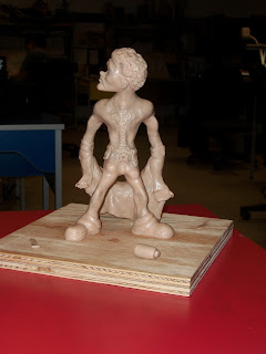
Steve Ustinksky Sculpted Model
This was my first Maquette I ever made, so I won't grill myself too hard for him not being perfect. But all and all I'm pretty pleased with him, and I'm glad I had the chance to traditionally paint him like the classic days in Animation, even though that took far far too long, and other projects got pushed back because of it, but all in all I can't complain too much.
The picture below is the pose I chose from my model pack to bring to life.
I started with a wood block and wire, then bulked up some skulpy on it,
Then I started fixing the features, and adding in details.
I then re-did the entire head and got rid of the wire inside to make it proportioned to him and then there was no more wire sticking out.
I then kept fixing and adding features.
Then it was time to gloss him up, and get rid of little pieces sticking off of him,
Then it was time to paint him up, about ten hours to do this right.
Here he is with his kissy lips.
Then I painted the stage, and ta da I was done-zies
Thursday, December 15, 2011
Wednesday, December 14, 2011
Concept and Character
Alrighty, so for this final assignment I originally wanted to do a GTA4 inspired type thing, but this had too many flaws in it to continue with it.
So I altered my composition so a cop was coming in through a gate and then my guy was hiding in a park behind a building, outside a city
So I added in the city and some fern trees and the sky. This didn't take to much time, but I wanted to do it right.
I then decided to put it at winter time and I spent forever painting some abstract purple trees and putting snow on them, plus the path way. And instead of a cop I changed the guy to a completely dead guy in the snow.
I then changed the character to Santa Clause marking off his naughty list.
Then I put it on steroids and added in the details and altered my composition slightly to open it up, put some snow in, some dragged out blood, more bodies, a little yellow and blue and fixed the writing on the "Naughy list"
And digital painting class is officially over, meaning my future weekends are almost free.
Tuesday, November 29, 2011
Concept Design
Alrighty, so we had to think of a concept design of sorts, but at the same time render it.
So I drew up this weird floating land mass thing with mountains while I was watching Dexter.
I then showed my design to my teacher and my class and took some intake and changed the design to an extent.
So I drew it up again and put more focus on the rock mountain city thing. I threw in some flats and made some painterly type shading for everything.
I then threw in a painted sky and foggy type clouds with some more rock texture and overlayed and warped it for my mountain structure.
I then put some windows in my buildings and put some lights on with a glow, and kept texturing and painting my rocks, and threw in a different batch of cities on the other rocks and pumped up my multiply and screen layers.
Then added in a watering filter system and put a little more detail in everything, and blurred the background stuff and made it less prominent to make the main mountain pop a little ...
Tuesday, November 15, 2011
Seriously He Hee? - Traditional Lip Sync
Glen's been working out pretty well with my animations thus far this year, so I decided to make a more realistic Glen...aka super freakin strong and when he laughs his pop out...to really enjoy this one go key frame to key frame to see all the horror inbetweens He Hee
I did the voice of Glen by the way :P ...Glen sucks at saying seriously
Checkered Cab Design
So for this assignment I had to create a vehicle. As per usual I started with the line art, I had to make sure to get the perspective right, much kudos to my teacher Omar Dogan, who helped me with the fisheye angle.
Then I threw in some flats and a rough tonal and idea of lighting to keep me on my feet and to make sure I don't deviate from that for the shine and harsher shadows later on.
So then I started looking at the individual pieces and cleaning up the bumper, and head lights and grill, and then it was only a matter of cleaning up the tires, mirrors, inside the car, the lighting, door knobs, antenna, spokes and hubcaps...you know, easy fixes, only about 10 hours of work for that stuff.
Then of course you have to end every painting with a little orange and blue gradients for some eye candy.
Monday, November 7, 2011
Sunday, October 23, 2011
Opening Door Final
After spending a lot of time on friday and finishing it up on saturday for a few hours I finally inbetweened and cleaned this bad boy up. It took too long, but it came out looking pretty smooth so I'm pleased with it.
Tuesday, October 18, 2011
Gorwalrus Monster painting
This is the Gorwalrus monster that breathes through a lung sac on the outside of his lizard like body.
It took far too long to get done, but I like how it came out. I started with my line art and flats and worked my way up with some shading. I built it up to make it look 3d, and then started to add some textures I made. And many overlays of paintbrushes and filters I used created what I wanted for textures. And then I used mostly the grass brush on scattering to get the hair right, and everybody was like, "you can't do that," and I was like, "if the glove fits."
when it came to cleaning it up I put some more screen and multiply layers in and added some more contrast with orange and blue, an orange gradient and a blue rim light on the opposite side. I added in a drop shadow that tryingly fits the characters light source. That's probably just about it...yep.
Friday, October 7, 2011
Face and Hands Digital Painting
After some struggles with this head and hands assignment I finally got it done. I started painting my pornstar character, but shortly realized he was wrong for this assignment by a long shot. So I drew this caricature based on loosely on David Bowie and Devin Cheribuni.
I started with the line art, then put some tonals in grey over it. I placed the light source as a lighter in his hand, assuming he's about to light a cig. Then when that was done I painted in some textures, mainly the wrinkles and old man spots, then the hair and nails came in.
I plopped the lighter and cigarette in and put on some overlays and tweaked the colours to make it as creepy as I could. I put on some final touches like the rim lighting and more wrinkles in the shirt and it was good enough for a good ol' fashioned night on the town.
Thursday, October 6, 2011
Saturday, September 17, 2011
BG Tonal
Okay, so our second project this year was more or less review from last year so I wasn't so stressed with it as I was the fish. But I didn't have a lot of free time this last week because of family stuff to work on it. I wanted to love the lines, but ran out of time, so what you see is the finish.
I started it the with a completely grey background, and working on the light and seeing how it would work in the real world without complicating it. I then put some shading in it, and then darkened it to give it a softer light look, as not to make it an over-bearing light, plus it gave it more emotion in the making, so I got two birds with one stone in that hit.
Other than that it was a pretty standard pen busting digital project.
Monday, September 12, 2011
Digital Fish painting breakdown
So our first assignment in Digital painting class was to paint a fish...easy enough right? Wrong!
I started off painting a flounder, the fish with both eyes on one side, and that was an epic failure, and 3 hours I'll never get back.
So I started to paint this tropical fish, I forget the technical name, but it's the same fish Dory was in Finding Nemo.
I started with the usual, line arts to flats, and a threw in some rough shading. I noticed the fish looked like it had freckles so I had to add those to the nose area. And for the teeth I made them more human like because I thought it was cuter and I didn't want to go for realism too too much for my fishy.
Then when it came to the scales, in a separate file I made about ten up in a template and masked them over my fish. Then I realized that looked awful, so I painted new shading and lighting over each one...aka hours of work just for the scales. So them I continued throwing in multiplay layers and screen layers to finish him off, including the fins. And I threw in a quick background and blurred it to focus more on my fishy.
Sunday, August 28, 2011
Anthony Kiedis (By The Way)
A portrait I did of Anthony Kiedis, the vocalist for Red Hot Chili Peppers, it took a few hours in my
free time over about a week.
Cartoon for Momma Yoch
Figured I should put something on this blog for August, so here we go!
It's me in my Animation uniform, aka me shirtless
Monday, July 18, 2011
Thursday, July 14, 2011
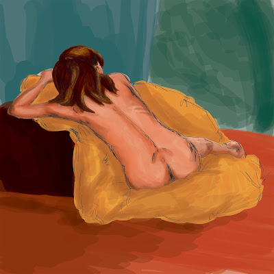
Claire Life Drawing Painting
This is one of the more finished pieces I've got done
digitally in my summer life drawing sessions in K-town
Subscribe to:
Comments (Atom)


